Composition Part 12 - Thumbnail Sketches
One of the best ways to ensure that your final rendering will have unity and impact is to work it out in a small sketch. If a thumbnail sketch is interesting, than the final rendering should have a strong presence.

The best artists have been sketching ideas throughout their careers; working out ideas on a small scale and in a cheap and quick manner. Da Vinci’s sketch of St. Anne is small and rough, but starts to suggest the pyramidal composition of the final masterpiece.

Rubin’s sketch for The Birth of Henri IV of France is more detailed, but conveys the serpentine composition clearly.

This sketch for Wolves Attack by Jozef Chelmonski is a wonderful piece of art in itself, but is also a roadmap for the execution of a large painting.

J. W. Waterhouse gets an amazing amount of feeling in this sketch of a Priestess on a Tripod. His final paintings were often reworked several times on the canvas, so this simple sketch was just the first impression.

Old Man on his Deathbedby Gustav Klimt is another sketch that could pass for a finished painting. In this case it was a study, and not the basis for a larger work.

Simone in a Blue Bonnet by Mary Cassatt is actually a full sized unfinished portrait, but it shows all the characteristics of a sketch.

Another sketch by Waterhouse, Listening to My Sweet Pipings, presents all the elements of the finished painting without getting involved in any details.
Architects and Architectural Illustrators also sketch to develop a strong design for their work. These sketches can range from the size of a postage stamp to a letter. The medium runs from the simplest pencil doodle to watercolor.

The Dubai Aquamarinaby Mohammed Bilbeisi is a fascinating conceptual sketch of a proposed development, suggesting context, trees, people and the hot climate.

Patricia Poundstone’s sketch entitled Fog Ocean Avenue Santa Monica is deceptively simple, while accurately delineating the atmosphere of the place.

Another evocation of place and time is this watercolor sketch, Strawbale House Theoreticalby Toshihiro Suwa.
The best advice I can give regarding thumbnail sketching is to simply do it. The following sketches were done at home, in restaurants and at parties. They range from 8” x 10” to postage stamp size, and were done with pencil, felt-tip pen, color pencil and pastel.


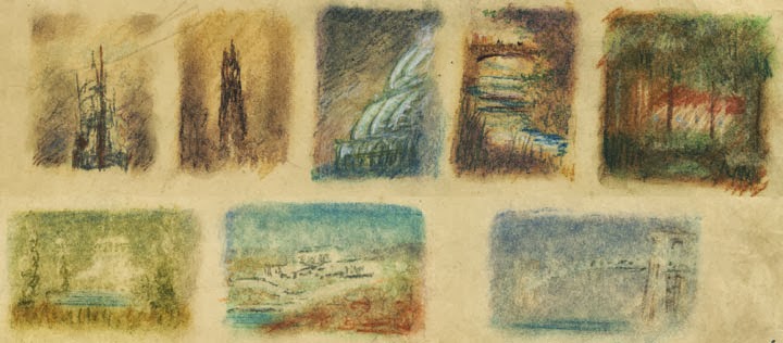


Every once in a while a sketch will just turn into an image that can’t be improved on…

This pastel sketch of a proposed interpretive center has been a favorite of mine for years, but I have never been able to enlarge it to my own satisfaction.
A caveat for all posts on composition.
You don’t want to produce total chaos.
You don’t want to create banal order.
You do want to entice, hint, and suggest.
You want to create mystery, even if the subject appears to be obvious.
- Composition Part 1 - Architectural Illustration
- Composition Part 2 - The Golden Section & other crutches
- Composition Part 3 - Dark Spot
- Composition Part 4 - Light Spot
- Composition Part 5 - The Cross
- Composition Part 6 - The Pyramid
- Composition Part 7 - Circle
- Composition Part 8 - Diagonal
- Composition Part 9 - "L" Frame
- Composition Part 17 - Value Studies- Composition Part 2 - The Golden Section & other crutches
- Composition Part 3 - Dark Spot
- Composition Part 4 - Light Spot
- Composition Part 5 - The Cross
- Composition Part 6 - The Pyramid
- Composition Part 7 - Circle
- Composition Part 8 - Diagonal
- Composition Part 9 - "L" Frame


Comments
Post a Comment